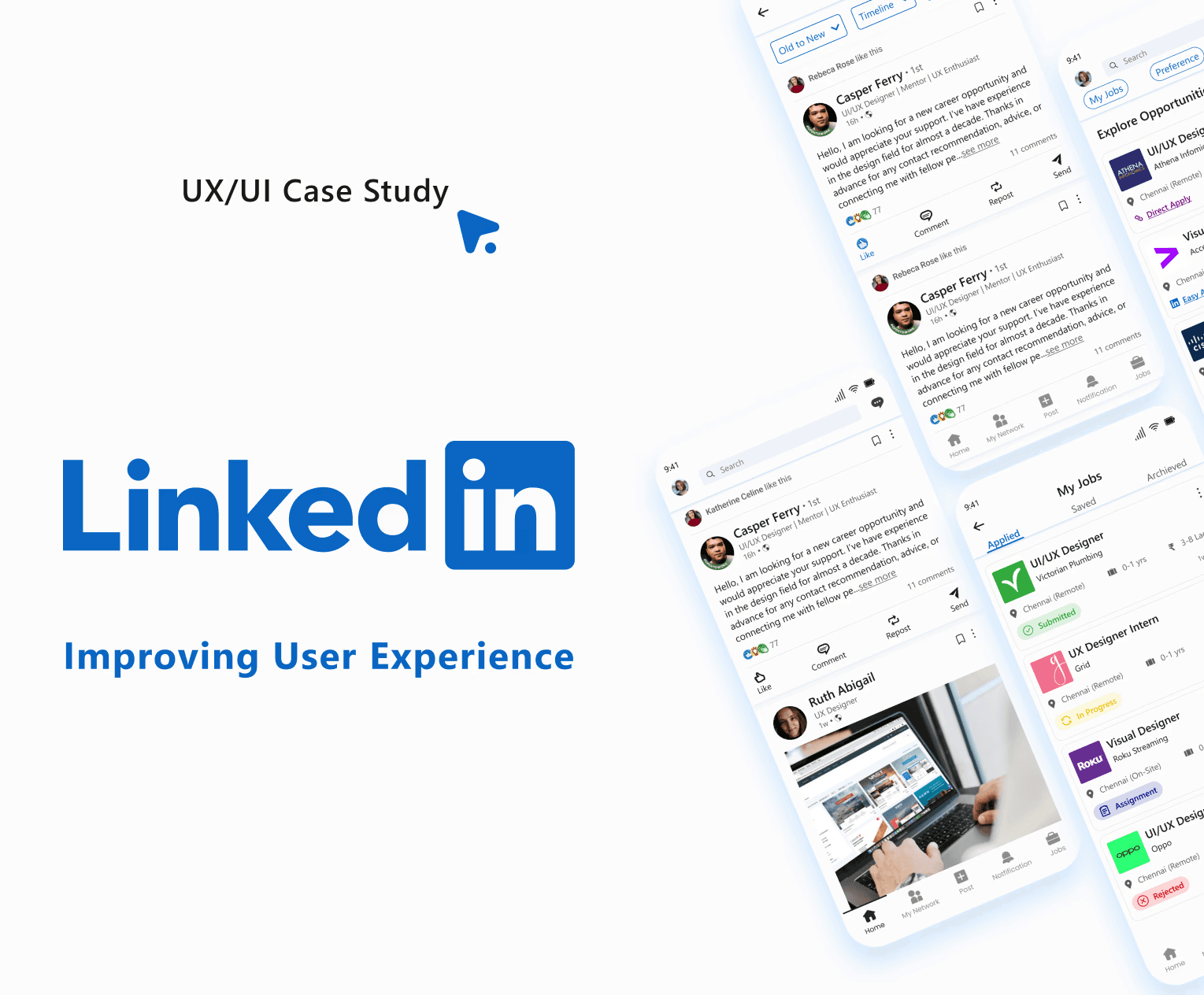
Improving LinkedIn app experience
Situation
As a UI/UX designer, I identified several pain points users face while navigating the LinkedIn mobile app. These issues include difficulty finding essential tabs, lack of organization for saved items, unclear job card details, and poorly designed screens.
Task
My task was to enhance the user experience by addressing the problems through better organization, clear labeling, improved accessibility, reduced interaction costs and cognitive load.
Action
Pain Points-
Navigation Issues:
Users struggle to find tabs like saved items, groups/communities, events, newsletters/reports, and log-out options in the side menu.
Job Functionality:
Job cards lacked critical details upfront, requiring users to open each listing.
The "My Jobs" section lacked clear categorization and application status updates.
Interaction and Visual Improvements:
Saving posts requires multiple steps. Lack of structure makes it difficult for users to manage saved content effectively. Inability to add images to polls limits visual comparisons. Poorly organized "My profile" section makes it hard for users to track their interactions.
Target Audience-
Job seekers
Professionals looking to network
Content creators on LinkedIn
Potential Solutions-
Navigation and Layout:
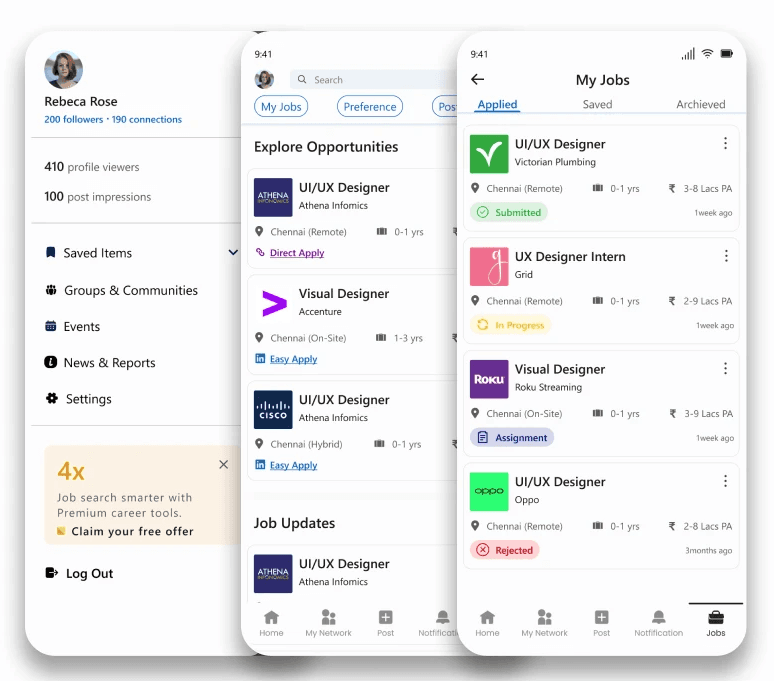
Side Menu - Clear icons and labels for essential tabs like saved items and settings improved navigation.
Job Functionality Enhancements:
Job Cards - Enhanced to show salary, experience, location, and application links directly on the card.
My Jobs Section - Categorized into Saved, Applied, and Archived with clear statuses and timestamps.
Interaction and Visual Improvements:
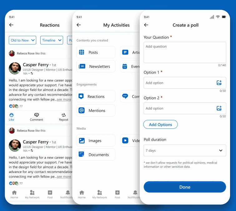
Save Button - Added for direct post saving, reducing interaction steps and the saved items are grouped into collections reducing the search time.
Image Polls - Enabled image uploads for richer poll engagement.
My Profile Organization - Reorganized the activities section into categories each with filters. The analytics section in grids has more clarity.
Result
The possible outcomes for implementing these changes are improved navigation, organization, and usability. Users will find it easier to locate tabs, manage saved items, quickly assess job listings, and interact with polls and activity sections, thereby enhancing overall user satisfaction.